Do you have any inkling of an idea that some of these famous logos carry a hidden meaning? If the answer is no, that makes the two of us. I just learned of it today and it really blows my mind when I discovered it for the first time.
Check out these 15 famous logos today with their awesome meanings cleverly hidden behind.
1. Amazon
You may initially notice that the Amazon logo looks like a smiley face, which could mean making the customers happy. But if you look a bit more closer, you’ll see that the arrow points from “a” to “z”. Now you know. The logo actually means that Amazon offers a wide variety of products from A to Z, literally.
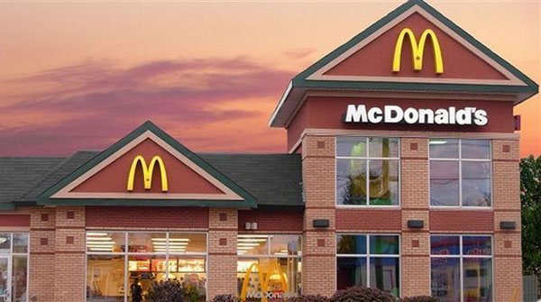
2. McDonald’s
The M stands for McDonald’s. That’s right. But do you know that in 1960s McDonald’s wanted to redesign the logo? But the company consultant and psychologist named Louis Cheskin insisted not to change the golden arches. He said the logo is the most effective one as it symbolizes “a pair of nourishing breasts” that customers unconsciously recognize (via BBC). Goes without saying, Cheskin succeeded to convince everyone and the logo is now one of the most widely recognizable in the world.
3. Apple
The Apple logo symbolizes the forbidden fruit from the “Tree of Knowledge.” That’s both classically simple and awesome.
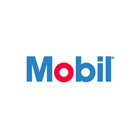
4. Mobil
The significance of the Mobil logo lies in its colors. The red letter “o” represents strength, while the blue color symbolizes security and faithfulness that the Mobil company provides to its customers.
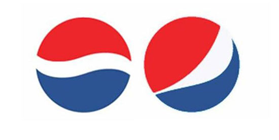
5. Pepsi
Pepsi spent $1 million in 2008 for Arnell Associates to come up with a new Pepsi logo (see the old one on the left side below, while the new one on the right). Pepsi afterwards paid millions of dollars for re-branding. The Arnell document, however, was leaked with the title “Breathtaking Design Strategy” proposing that the new logo is some kind of a Da Vinci Code. The document reveals that the Pepsi logo draws on the Renaissance, Feng shui, Earth’s Geodynamo, theory of relativity, the universe and more. Learn more at Gawker.
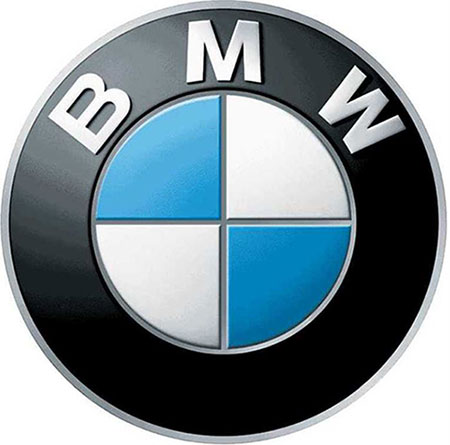
6. BMW
BMW has a history in aviation creating aircraft engines during World War II. This naturally influenced its creation of its present logo, staying true to its roots. The white and blue in the middle symbolize a propeller in motion.
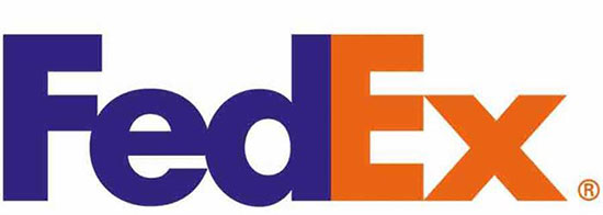
7. FedEx
This is a creative one. If you look closely, the FedEx logo has a cleverly inserted arrow between letters “E” and “x”. This represents the company’s forward-thinking business philosophy.
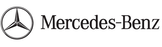
8. Mercedes-Benz
The Mercedes-Benz logo exudes an aura of greater confidence among any other logos. They said that the tri-star symbolizes the company’s dominance in style and quality over the sea, air and land.
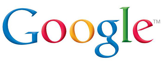
9. Google
Google is very clever when it comes to symbolism using colors. Their logo uses four primary colors then breaks it with a secondary one, which means that Google doesn’t play by the rules and conventions.
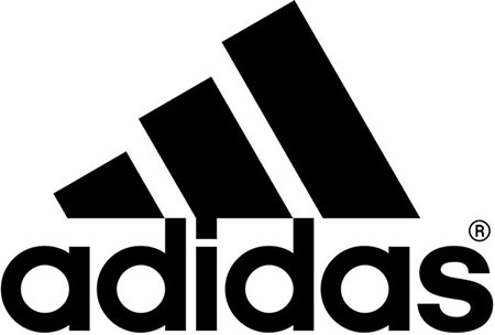
10. Adidas
The Adidas logo looks like a mountain, which is exactly what it is supposed to mean. The three slanted stripes symbolize three mountains or obstacles that people need to overcome.
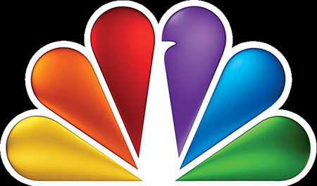
11. NBC
You’re right it’s a peacock. But why there are so many colors? That is because during the 1950s, the owner of NBC was RCA, which had started to manufacture color televisions. They wanted people who are still watching on black-and-white TV to know they’re missing a lot. So they designed a colorful logo.
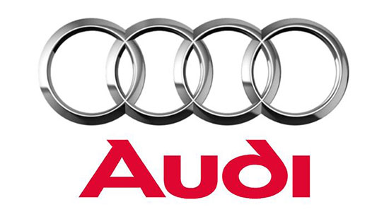
12. Audi
The four circles on the Audi logo represent the four founding companies (DKW, Horch, Wanderer and Audi) of the Auto-Union Consortium way back in 1932.
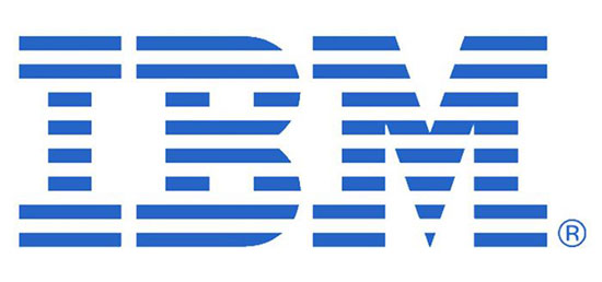
13. IBM
The IBM logo has a cool message hidden in the big blue design. See that white lines or blue ones, whichever you prefer? They look like equal signs which symbolize equality.
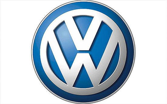
14. Volkswagen
The Volkswagen logo is one of the simplest out of the bunch with a heartwarming meaning. The “V” stands for “Volks” which means people in German. The “W” stands for “Wagen” which means car. Taken together the logo means: “the car for the people!”
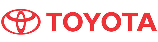
15. Toyota
The Toyota logo has three ellipses, which represent three hearts: the heart of the product, the heart of the customer, and the heart of progress in the technology field.
(H/T to Diply)