We see these famous logos of popular companies almost everywhere. But we seldom give a second thought to their origin, or what each emblem signifies for. We take care of that for you, dear readers. Here are the astonishing stories behind well-known logos. Enjoy!
Apple
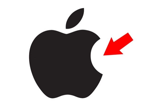
Many said that the most valuable Apple logo was dedicated to Alan Turing, who ended his life by biting into a poisoned apple. But the designer Rob Janoff said that he made the bitten apple to show its dimensions because a whole apple can be easily confused with any other round fruit.
Ferrari
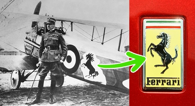
Many believed that the Ferrari logo symbolizes horsepower. Not true. In Enzo Ferrari’s biography, he wrote that the horse silhouette was initially painted on the plane of Italian ace pilot Francesco Baracca. Francesco’s mother gave the symbol to him after his victory in a race. It later one became a world-famous symbol.
© Wikipedia Commons | © junpinzon/depositphotos.com
Wikipedia
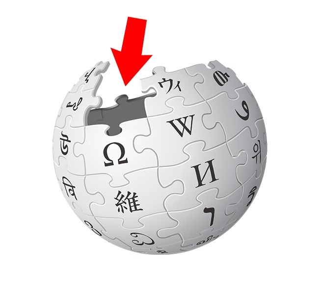
Wikipedia has the cool-looking worldwide encyclopedia’s emblem. The puzzle pieces signify multilingualism. Each with letters of different languages, which, if taken together, make the word “wikipedia.” The missing pieces indicate Wikipedia is never finished.
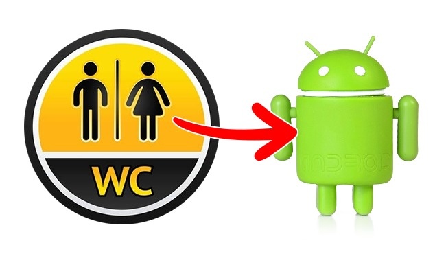
Android
Designer Irina Blok and her team were tasked of creating a logo that would be easily recognized. This may sound funny but they got the inspiration from the symbols used on public bathrooms.
© EAST NEWS | © imago/STAR-MEDIA/EAST NEWS
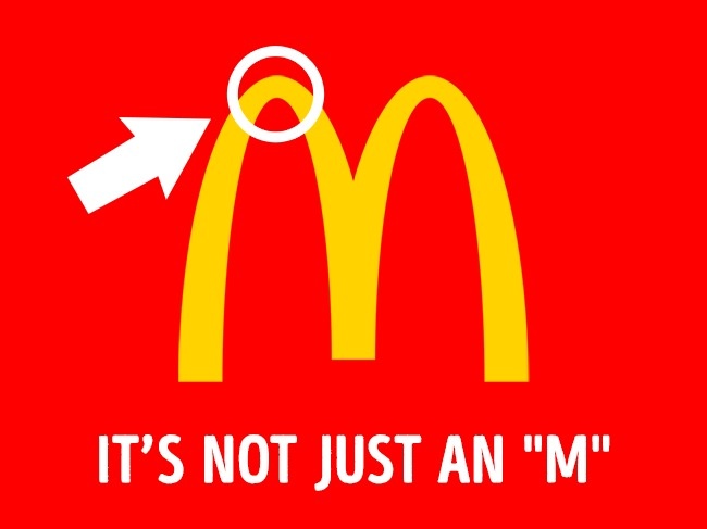
McDonald’s
In 1962, psychologist Louis Cheskin hired by McDonald’s suggested to replace their old logo with golden arches making an “M.” His reason is that the shape resembles female breasts that will subconsciously arouse appetite and reminds customers of their happy childhood.
Lacoste
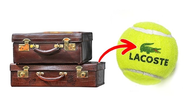
In 1923, René Lacoste and Alan Moore, the captain of René’s tennis team, made a bet that if René won his next game in tennis, Alan would buy the crocodile skin suitcase they saw in a shop window. Lacoste lost the game, but a journalist heard about their bet and wrote a story about a certain tennis player who “fought like a crocodile” though he lost the game. It was how Lacoste got his nickname. He later used it as the emblem of his company.
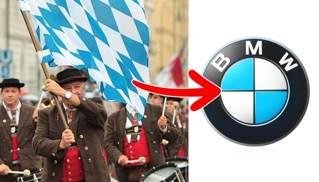
BMW
Some believed that the BMW logo symbolizes an airplane propeller. But it’s all simpler than that: the blue and white were chosen to represent the colors of Bavaria.
© imago/Ralph Peters/EAST NEWS | © rozelt/depositphotos.com
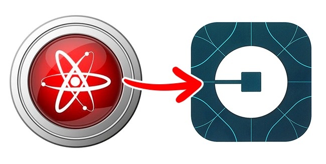
Uber
Uber changed its original logo from a “U” to something that looks like atoms. Uber says that the new logo symbolizes that their cars can be found anywhere, just like atoms.
© EAST NEWS | © rozelt/depositphotos.com
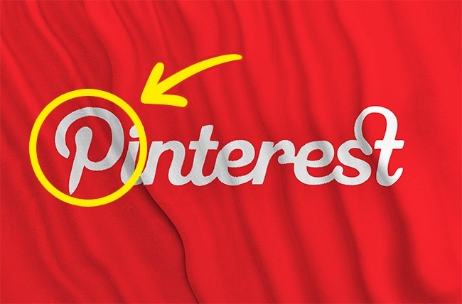
Pinterest
If you look closely at the first letter of the Pinterest logo, it resembles a pin we might use for pinning papers or photos to walls.
© maziarAgha/depositphotos.com
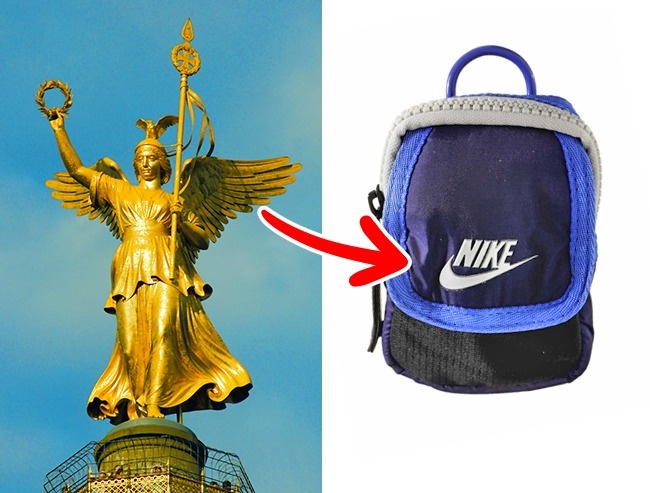
Nike
This is easily one of the most world’s most recognizable logos It’s also one of the cheapest ones as it only cost $35 for Phil Knight, the owner of the company, who paid student Carolyn Davidson for her design in 1971. Phil was not happy with the design at first. He turned out to be wrong. The logo became amazingly successful. The logo was often associated with a wing of Nike, the goddess of victory.
© Album / M. Flynn / Prisma/EAST NEWS | © EAST NEWS
Starbucks
Did you know that the Starbucks logo is a mermaid holding two of her tail fins. This symbol was inspired by the myth of the fairy Melusine, a woman-fish with two tails who married a mortal man. The whole picture of the mermaid could be seen on coffee cups in 1971. It was later “censored.”

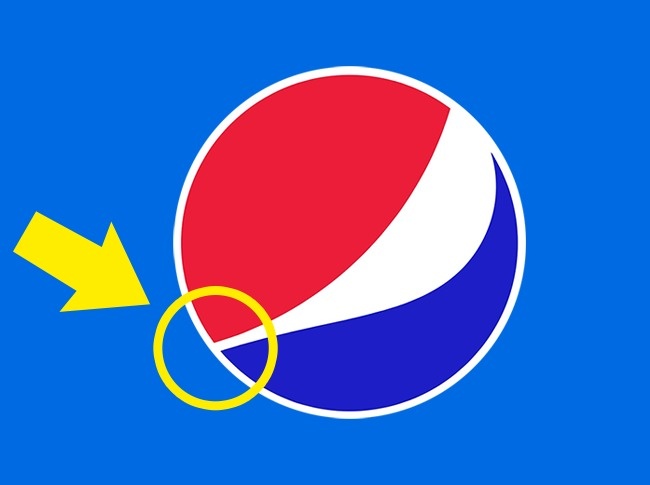
Pepsi
The Pepsi logo cost $1 million for the design. The Pepsi company hired designers and asked them to develop a logo according to the proportions of the golden ratio, which is presumed to be the most harmonious and pleasant for the human eye.
© severoes29/depositphotos.com
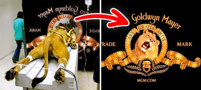
Bonus: The Metro Goldwyn Mayer lion
Let’s get this out of the way: this is definitely NOT how MGM made their famous roaring lion logo. When viewing the mascot of Metro Goldwyn Mayer Studios since 1917, not many people know that there have actually been 7 different lions used for this purpose. They were trained to roar on cue. As for the picture currently circulating around the Web, it’s fake, of course. The lion on it is preparing for an MRI scan to save it from some illness.